Benchmarks / DeckBench / Pantry Lane

Measured by Spring Prompt

Claude Fable 5.1: Paid media: H1 2026 allocation

For the CMO and the finance director. The decision it supports: how to allocate the £2.4m paid media budget for H1 2026.

Verdict
Not presentable
Deck rating
1,256
Slides
6 (brief: 5-8)
Design quality
33%

Why it is not presentable

  • Layout defect: something off the slide, colliding, too small or too faint to read
  • Quoted a figure the analysis says not to quote
  • A slide the judges rated as needing work

In detail

  • Slide 4 quotes 15,000: the agency's unvalidated forecast of 15,000 new TikTok customers.
  • Slide 6 quotes 15,000: the agency's unvalidated forecast of 15,000 new TikTok customers.
  • Slide 2: 2 text boxes set at 9 pt, too small to read
  • Slide 3: 2 text boxes set at 9 pt, too small to read
  • Slide 4: 2 text boxes set at 9 pt, too small to read
  1. Slide 1 of Claude Fable 5.1's deck
    Slide 1Download slide imageAcceptable The title wraps with '2026' alone on the second line, awkwardly separating the planning period.The title wraps and leaves '2026' alone on the second line; rebalance the break or tighten the wording.
  2. Slide 2 of Claude Fable 5.1's deck
    Slide 2Download slide imageNeeds work The chart title is cut off on the right, leaving its explanatory definition incomplete.The chart title is cut off at the right edge ('...revenue ÷ sp').
  3. Slide 3 of Claude Fable 5.1's deck
    Slide 3Download slide imageNeeds work The chart title is clipped at both ends, obscuring the test duration and measurement unit.The chart title is clipped on both sides ('-week holdout test...' and '...per 10,000 ho').
  4. Slide 4 of Claude Fable 5.1's deck
    Slide 4Download slide imageAcceptable The right column is text-heavy, with a large empty gap between the proposal and the bottom warning box.There is a large empty gap in the right column between the 'What we propose' text and the 'Not to be quoted' callout.
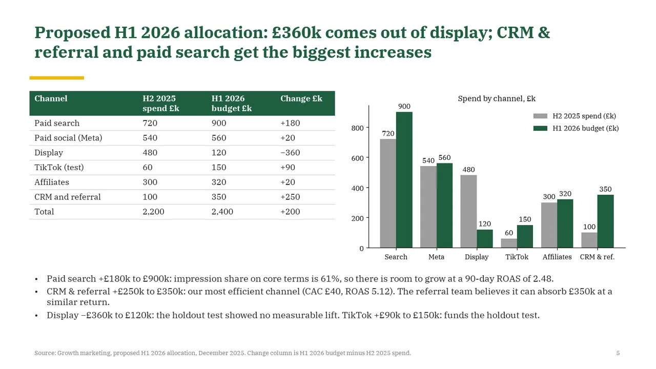
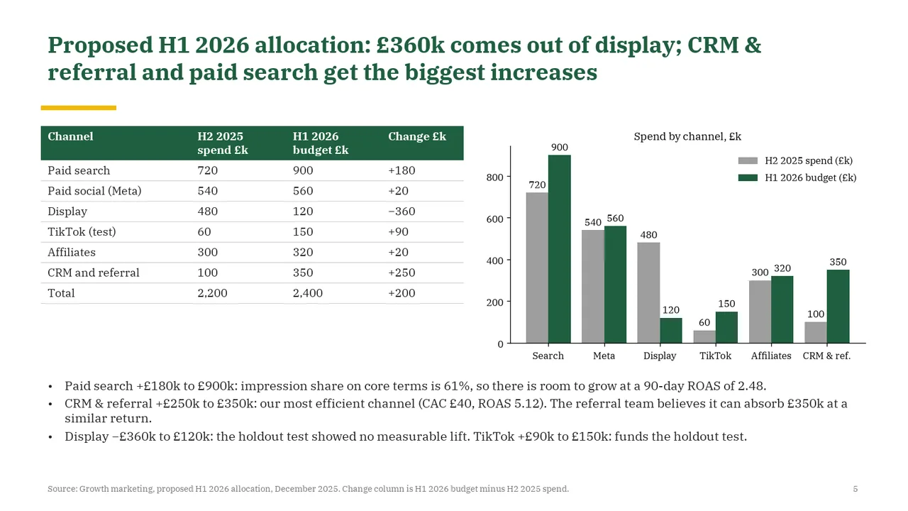
  5. Slide 5 of Claude Fable 5.1's deck
    Slide 5Download slide imageAcceptable The table and chart duplicate most values, increasing visual density.The table and the chart show the same numbers, which is redundant and makes the slide dense.
  6. Slide 6 of Claude Fable 5.1's deck
    Slide 6Download slide imageAcceptable The approval cards contain dense paragraphs rather than concise decision statements.The title is a topic label rather than a takeaway.